
Beauty Tools & Accessories
Revived: The National Flatware of Denmark
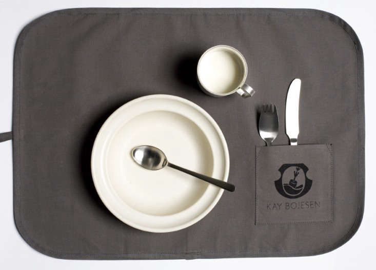
Jul
Some national treasures sit behind velvet ropes. Others arrive beside your dinner plate and spend the evening tackling roasted carrots.
Kay Bojesen’s Grand Prix cutlery belongs firmly in the second category. Designed in Denmark in 1938, the streamlined flatware became an enduring example of Danish modern design: practical enough for breakfast, elegant enough for a diplomatic dinner, and distinctive without behaving as though every fork deserves its own spotlight.
After winning a major prize at the Milan Triennale in 1951, the collection acquired the name Grand Prix and eventually became widely known as the national flatware of Denmark. It has appeared in Danish diplomatic residences, museums, design-conscious restaurants, and homes where people understand that a spoon can be simple without being boring.
Its revival proves that excellent industrial design does not expire merely because several decades pass. Grand Prix remains relevant because it solves an ordinary problem extraordinarily well: helping people eat comfortably while making the table look better.
How a Fork Became a Danish Design Symbol
Kay Bojesen Was More Than the Man Behind the Monkey
Many people first encounter Kay Bojesen through his famous wooden monkey, a cheerful articulated figure that has become an international symbol of Scandinavian design. Yet Bojesen began his career as a silversmith and trained in the workshop of Georg Jensen, one of Denmark’s most influential names in silverware.
That background matters. Grand Prix cutlery was not created by someone treating flatware as a decorative side project. Bojesen understood metal, proportion, craftsmanship, and the relationship between an object and the hand using it. He knew that a beautiful spoon still had to scoop soup without staging a small maritime disaster.
As his career developed, Bojesen moved away from heavily ornamented silver objects. He became increasingly interested in functionalism, industrial production, and forms that could serve ordinary life. His work retained warmth and personality, but unnecessary decoration was shown the door.
The Original 1938 Design
Bojesen introduced the flatware design in 1938. The first pieces were conceived in silver and built around a direct visual language: clean handles, softened transitions, balanced proportions, and working ends shaped for their actual jobs.
The fork was recognizably a fork, not a miniature sculpture trying to win an argument. The spoon had a generous but controlled bowl. The knife appeared sturdy without looking heavy. Every line contributed either to comfort, balance, or usefulness.
This approach placed Grand Prix squarely within the development of Danish functionalism. Instead of separating beauty from utility, Danish designers often treated usefulness as the starting point of beauty. A chair should support the body. A lamp should control light. A fork should feel natural before the second bite.
The Milan Prize That Gave Grand Prix Its Name
In 1951, Bojesen’s cutlery received first-prize recognition at the Milan Triennale, one of the era’s most important international showcases for architecture, decorative arts, and industrial design. The achievement gave the collection its lasting name: Grand Prix.
The award did more than provide excellent marketing material. It confirmed that an everyday object could represent serious design achievement. Flatware is handled repeatedly, washed constantly, dropped occasionally, and judged at unusually close range. Unlike a decorative vase, it cannot rely on looking attractive from across the room.
Grand Prix succeeded because it was visually disciplined and physically convincing. Its restrained form communicated modernity without embracing novelty for novelty’s sake. That distinction is one reason the collection has aged so gracefully. Trend-driven products often advertise the decade in which they were born. Grand Prix quietly refuses to reveal its age.
From Precious Silver to Practical Stainless Steel
Silver gave the original flatware refinement, weight, and traditional prestige. It also came with a price tag and maintenance routine that made broad everyday use difficult. A national design icon is not especially democratic when everyone is afraid to take it out of the cabinet.
In 1953, a matte stainless-steel version was presented as a more accessible alternative. This transition was perfectly aligned with Bojesen’s functional philosophy. Stainless steel made the design more durable, easier to maintain, and better suited to modern kitchens.
The material shift did not reduce the importance of the design. In many ways, it completed the idea. The forms were no longer limited to formal silver service. They could be used for oatmeal, takeout noodles, holiday dinners, and the mysterious leftovers that have been living in the refrigerator since Tuesday.
Contemporary Grand Prix pieces have been produced in both matte and polished stainless-steel finishes. The matte version emphasizes the collection’s understated character, while the polished finish brings more reflection and formality to the table.
Why It Is Called the National Flatware of Denmark
Grand Prix is commonly described as Denmark’s national flatware because of its cultural status and reported use in Danish embassy residences around the world. The title is less about a government proclamation than about what the design represents: Danish craftsmanship, functional thinking, visual restraint, and respect for everyday objects.
That symbolism is easy to understand. Diplomatic interiors must communicate national identity without turning every meal into a theme-park presentation. Grand Prix performs this task beautifully. It looks Danish without relying on flags, carved Vikings, or a tiny pastry attached to every handle.
The flatware also expresses a broader Scandinavian principle: good design should participate in daily life. It should not be protected from fingerprints or saved exclusively for people whose names appear on embossed invitations.
By serving meals with Grand Prix cutlery, an embassy can present Denmark through an object that guests physically experience. They feel its weight, notice its proportions, and use it throughout the meal. Cultural identity becomes tactile rather than merely decorative.
The Revival of an Almost-Lost Classic
A Family-Led Return
The modern revival of Grand Prix was led by Kay Bojesen’s granddaughter, Susanne Bojesen Rosenqvist, often known as Sus. In 2011, she established a company dedicated to carrying forward her grandfather’s silver-design heritage and returning the iconic flatware to production.
This was more than a nostalgic reissue. Reviving an archival design requires interpretation, manufacturing decisions, quality control, and respect for original proportions. Make the handles too thick and the elegance disappears. Alter the working ends too aggressively and the user experience changes. Add fashionable decoration and the entire point wanders off to buy a novelty napkin ring.
The revived collection retained the original functional character while making the pieces available in contemporary steel finishes. A broader assortment also allowed buyers to build a complete table setting, including dinner utensils, smaller spoons, serving pieces, and specialized tools.
From Design Archive to Restaurant Table
The renewed Grand Prix collection quickly found admirers in modern hospitality. Chef Matthew Orlando selected the flatware for Amass, his acclaimed Copenhagen restaurant. The understated utensils worked naturally within the restaurant’s industrial interior, where concrete, wood, muted surfaces, and carefully composed food shared the visual stage.
The choice was significant. Professional restaurants expose flatware to constant handling, washing, stacking, and scrutiny. A utensil cannot survive on pedigree alone when it must perform through multiple services every day.
Grand Prix also appeared at the Monocle Café in London, extending its reach beyond Denmark while reinforcing its identity as a practical international design classic.
What Makes Grand Prix Flatware So Distinctive?
Restraint Without Coldness
Minimalist flatware can sometimes feel clinical, as though it was designed for a laboratory where seasoning is prohibited. Grand Prix avoids that problem. Its geometry is controlled, but the contours are softened. Handles widen gently, transitions feel considered, and the pieces possess enough visual character to remain memorable.
This balance between rigor and friendliness appears throughout Bojesen’s work. His wooden animals are simplified but expressive. His metalwork is disciplined but never joyless. Grand Prix follows the same philosophy: remove what is unnecessary, then make what remains feel human.
Proportions Designed for Real Hands
The success of flatware depends on details people may not consciously notice. Handle width affects grip. Weight distribution affects fatigue. Fork-tine length influences how food is collected. Spoon depth changes how naturally the utensil enters the mouth.
Grand Prix treats these decisions as part of the overall design rather than engineering details to be hidden afterward. The pieces have visual continuity, but each utensil remains shaped for its individual function.
A Complete Family of Tools
The collection extends well beyond the basic knife, fork, and spoon. Depending on the market and production period, the Grand Prix family has included teaspoons, coffee spoons, dessert utensils, lunch pieces, serving spoons, cake servers, salad tools, and other specialized forms.
The variety reflects a period when table settings were more elaborate, but it also gives modern buyers flexibility. A household can begin with essential place settings and add serving pieces gradually instead of purchasing an enormous boxed collection containing twelve tools nobody can identify.
Matte or Polished Grand Prix Cutlery?
The choice between matte and polished stainless steel changes the mood more than the underlying design.
Matte Grand Prix
The matte finish feels calm, architectural, and distinctly modern. It softens reflections and pairs especially well with stoneware, natural linen, concrete surfaces, smoked wood, and neutral ceramics. Fingerprints are generally less dramatic, which is useful when guests insist on touching their forks before dinner.
Polished Grand Prix
The polished version brings brightness and a slightly more formal character. It reflects candlelight and complements porcelain, glassware, polished serving dishes, and classic dining rooms. Fine scratches may become visible over time, although many owners consider those marks part of the natural patina of a frequently used object.
Neither finish is inherently superior. Matte emphasizes Scandinavian restraint; polished steel emphasizes the collection’s silversmithing ancestry.
How to Care for Grand Prix Stainless-Steel Flatware
Stainless steel is resistant to corrosion, not magically protected by an invisible force field. Proper care helps preserve the finish and prevents staining.
Rinse utensils after contact with salty, acidic, or strongly colored foods, particularly when the pieces will sit for several hours before washing. Avoid leaving damp flatware crowded together in a sink. Prolonged exposure to food residue and moisture can encourage spotting.
When using a dishwasher, place the pieces so water can circulate freely. Do not wash stainless flatware in direct contact with utensils made from ordinary carbon steel, because contact between different metals can contribute to corrosion marks. Remove and dry the pieces after the cycle when possible.
A nonabrasive cloth and mild detergent are generally sufficient for hand washing. Harsh scouring pads may create visible scratches, especially on polished surfaces. When stubborn spots appear, use a cleaning method specifically approved for quality stainless steel rather than attacking the spoon with whichever chemical is closest to the sink.
Why the Grand Prix Revival Still Matters
The renewed interest in Grand Prix flatware reflects a larger shift toward durable, repairable, and emotionally lasting household objects. Consumers are increasingly questioning the logic of buying inexpensive products repeatedly when one thoughtfully designed set could remain useful for decades.
Classic Danish flatware fits naturally into that conversation. Stainless steel is durable, the forms are not tied to a temporary decorating trend, and individual pieces can often be added as a household grows.
Longevity also reduces visual fatigue. Grand Prix does not shout for attention when first placed on the table, so owners are less likely to become tired of it six months later. It supports changing dinnerware, linens, interiors, and occasions without demanding that everything coordinate around the forks.
This is perhaps the most persuasive argument for revived design classics. They have already passed through multiple cycles of fashion. Their continued appeal is not based on a social-media moment but on proven usefulness and recognizable quality.
The Experience of Living With Denmark’s National Flatware
First Impressions at the Table
The experience of Grand Prix begins before anyone takes a bite. At a place setting, the pieces create a clean visual rhythm. The handles align easily, the silhouettes are distinct without becoming decorative clutter, and the steel works with almost any plate.
On a white tablecloth, the polished version can look quietly ceremonial. Beside handmade pottery, the matte finish feels more relaxed and contemporary. The same design can move from a formal dinner to a bowl of cereal without appearing overdressed or underprepared.
That flexibility changes how “special” flatware is used. Instead of waiting for holidays, owners can make it part of the daily routine. The pleasure comes from repetition: reaching for the same well-proportioned spoon every morning and noticing that it still feels right.
During the Meal
Once the meal begins, the design becomes less visually obvious and more physically important. A successful utensil should almost disappear into the action. It should not twist in the hand, pull attention away from the food, or require an advanced degree to balance a pea.
Grand Prix feels purposeful rather than theatrical. The straight, gently widening handles offer a stable grip. The utensils appear substantial enough to inspire confidence without becoming cumbersome. Their softened contours prevent the strict geometry from feeling sharp or mechanical.
This is where Bojesen’s silversmithing experience becomes tangible. The flatware was not merely drawn as a pleasing outline. It was developed as a group of tools meant to interact with fingers, plates, serving dishes, and food.
Hosting With Grand Prix
When guests arrive, Grand Prix helps a table feel considered without making the host seem as though the dining room has been prepared for a royal inspection. The design is refined but not intimidating.
Some visitors may recognize it immediately. Others may simply notice that the utensils feel unusually balanced. Both reactions are valuable. Good design does not require everyone to know the designer’s biography before enjoying dinner.
The pieces are particularly effective when the rest of the table contains varied textures. Matte steel can calm colorful ceramics. Polished steel can brighten rustic wood. Against simple glassware and linen napkins, the flatware supplies enough structure to make the arrangement feel finished.
The Everyday Routine
The real test arrives after the guests leave. Beautiful objects are easy to admire before they encounter tomato sauce, dishwashers, crowded drawers, and family members who treat teaspoons as tools for opening packages.
Stainless-steel Grand Prix was revived precisely because the form can participate in ordinary life. With sensible care, it does not require the polishing ritual associated with traditional silver. Scratches and small signs of use gradually become evidence that the set belongs to a household rather than a showroom.
There is also satisfaction in using a design connected to several generations. The meal may be modern, the kitchen may contain induction burners and a smart refrigerator, but the fork’s essential form reaches back to Bojesen’s 1938 concept.
The Emotional Experience of a Useful Classic
Objects used every day can accumulate meaning almost accidentally. A serving spoon appears at birthdays. A small fork becomes a child’s favorite. One teaspoon is repeatedly borrowed for coffee and somehow never returned to the correct drawer.
Because Grand Prix avoids excessive styling, it leaves room for those personal associations. The design supplies continuity while meals, homes, and families change around it.
That may be the deepest appeal of Denmark’s national flatware. It turns design history into something intimate. You do not have to visit a museum to experience Bojesen’s ideas. You can encounter them while eating scrambled eggs.
Conclusion: A Design Worth Bringing Back
The revival of Kay Bojesen’s Grand Prix cutlery demonstrates why certain objects outlive the circumstances in which they were created. Its clean forms, balanced proportions, durable materials, and functional honesty remain persuasive nearly a century after the original 1938 design.
The Milan award gave the collection its name, but everyday performance gave it longevity. Grand Prix became associated with Danish national identity not because it was loud or ceremonially grand, but because it expressed the country’s design values through an ordinary tool.
Today, it can still serve diplomatic dinners, restaurant tasting menus, family celebrations, and hurried weekday lunches with equal confidence. That is an impressive résumé for a fork.
Note: “The national flatware of Denmark” is a widely used cultural and design-world description of Grand Prix, reflecting its iconic status and association with Danish diplomatic residences rather than a statutory government designation.

