Body Care
How to Illustrate a Children’s Book: 13 Steps
May
Note: This article synthesizes practical guidance from reputable publishing, illustration, printing, accessibility, and copyright resources. Source links are intentionally not inserted so the HTML stays clean for web publishing.
Illustrating a children’s book looks adorable from the outside: tiny boots, moonlit bedrooms, grumpy ducks, suspiciously expressive trees. Then you sit down to draw page one and realize the duck must look like the same duck for 32 pages, the moon must not swallow the text, and the child protagonist has somehow changed height three times before breakfast. Welcome to children’s book illustrationwhere charm meets planning, and every crayon-colored decision has a job.
Whether you are an author-illustrator, a freelance illustrator, or a self-publishing creator, learning how to illustrate a children’s book means more than making pretty pictures. A successful picture book balances storytelling, character consistency, pacing, page turns, typography, printing specs, and the emotional logic of young readers. Children notice everything. If your raccoon wears a red scarf on Monday and a blue scarf on Tuesday for no reason, a five-year-old will politely investigate the crime scene.
This guide walks through 13 practical steps for turning a manuscript into a polished illustrated children’s book. It covers concept art, thumbnails, dummy books, final artwork, print preparation, accessibility, and revisionbecause the best books feel magical, but the process is usually part imagination, part spreadsheet, and part “where did I put that layer?”
How to Illustrate a Children’s Book: 13 Steps
1. Read the Manuscript Like a Story Detective
Before drawing a single character, read the manuscript several times. The first read is for emotion: Is the story funny, tender, adventurous, spooky, cozy, or delightfully chaotic? The second read is for structure: Where does the story begin, build, turn, and resolve? The third read is for visual opportunities: Which moments should be shown, which should be implied, and which can be made funnier through pictures?
In children’s book illustration, the artwork should not merely repeat the text. If the sentence says, “Milo was nervous,” the illustration might show Milo hiding behind a cereal box while his toast wears a tiny crown because his imagination has gone rogue. The image adds storytelling value. It gives young readers something to discover.
Mark emotional beats, repeated phrases, scene changes, and moments that need page-turn suspense. A page turn is not just a place where paper moves. It is a tiny stage curtain. Use it wisely.
2. Define the Age Group and Reading Experience
A board book for toddlers, a preschool picture book, and an early reader all need different visual strategies. Toddlers respond well to bold shapes, clear expressions, familiar objects, and high visual clarity. Preschoolers can follow more detailed scenes, humorous subplots, and expressive character acting. Early elementary readers can handle richer environments, visual clues, and more complex sequential storytelling.
Also consider how the book will be read. Many picture books are read aloud by adults, meaning the illustrations must support both the listening child and the page-holding grown-up. The child may be scanning the image while the adult reads. That means visual clarity matters. Crowded art can be beautiful, but if the key action is buried behind seven decorative mushrooms and a dramatic teapot, the story may trip over its own wallpaper.
3. Study Comparable Children’s Books
Before finalizing your visual direction, study recently published children’s books in the same category. Look at trim sizes, page counts, color palettes, character proportions, use of white space, text placement, and pacing. Do not copy another illustrator’s style. Instead, learn how professional books solve practical problems.
Notice how many picture books use 32 pages, how endpapers create atmosphere, how title pages can begin the story, and how illustrations often carry emotional details that the text leaves unsaid. Study books that are funny, quiet, lyrical, educational, or action-heavy. A bedtime story and a dinosaur chase book do not need the same rhythmunless the dinosaur is very sleepy, in which case, excellent.
Create a small reference board for mood, not imitation. Include color inspiration, setting details, clothing references, animal anatomy, architectural cues, or historical elements if needed. Good reference keeps your imaginary world believable.
4. Build Character Designs That Can Survive a Whole Book
Character design is one of the most important parts of illustrating a children’s book. Your main character must be recognizable from the front, side, back, close-up, far away, happy, furious, sleepy, muddy, and possibly upside down. A design that looks wonderful in one pose but collapses in motion will become a problem by page six.
Create character sheets with multiple expressions and body positions. Decide on proportions, clothing, accessories, hair shape, markings, and color. If your fox has three freckles on one cheek, write it down. Future you will be grateful. Future you is usually tired and surrounded by coffee cups.
For child characters, avoid making them look like tiny adults. Children move, stand, and react differently. Their gestures are often big, honest, and slightly wobbly. For animal characters, decide how human they are. Can the bear hold a spoon? Wear pajamas? Pay taxes? Hopefully not the last one.
5. Choose a Visual Style That Matches the Story
Your illustration style should serve the manuscript. A gentle grief story may need soft textures, muted colors, and quiet compositions. A silly book about a runaway sandwich might call for bright colors, energetic lines, and exaggerated expressions. Style is not decoration; it is tone made visible.
Think about medium, too. Watercolor can feel warm and organic. Gouache can be bold and velvety. Pencil and ink can add intimacy and movement. Digital illustration offers flexibility, clean revisions, and easy file preparation. Mixed media can create a distinctive look, but it also requires a reliable workflow so the book feels cohesive.
Consistency matters more than showing every trick you know. A children’s book is not a portfolio buffet. Pick a visual language and stay with it long enough for readers to trust the world.
6. Break the Story Into Pages and Spreads
Once you understand the manuscript, divide it into page turns. A standard fiction picture book often has around 32 pages, though front matter and back matter affect how much space is available for the actual story. Self-published books can vary, but choosing a common structure helps with printing, pacing, and reader expectations.
Create a page breakdown that lists what text appears on each page or spread. Look for natural pauses, surprises, and emotional shifts. Avoid placing too much text on one spread unless the design can handle it comfortably. Children need time to look. Adults need room to read without squinting like they are decoding a secret squirrel treaty.
Ask yourself: What makes the reader want to turn the page? A question? A joke? A reveal? A sound? A visual clue? Strong page turns create momentum and make the book more fun to read aloud.
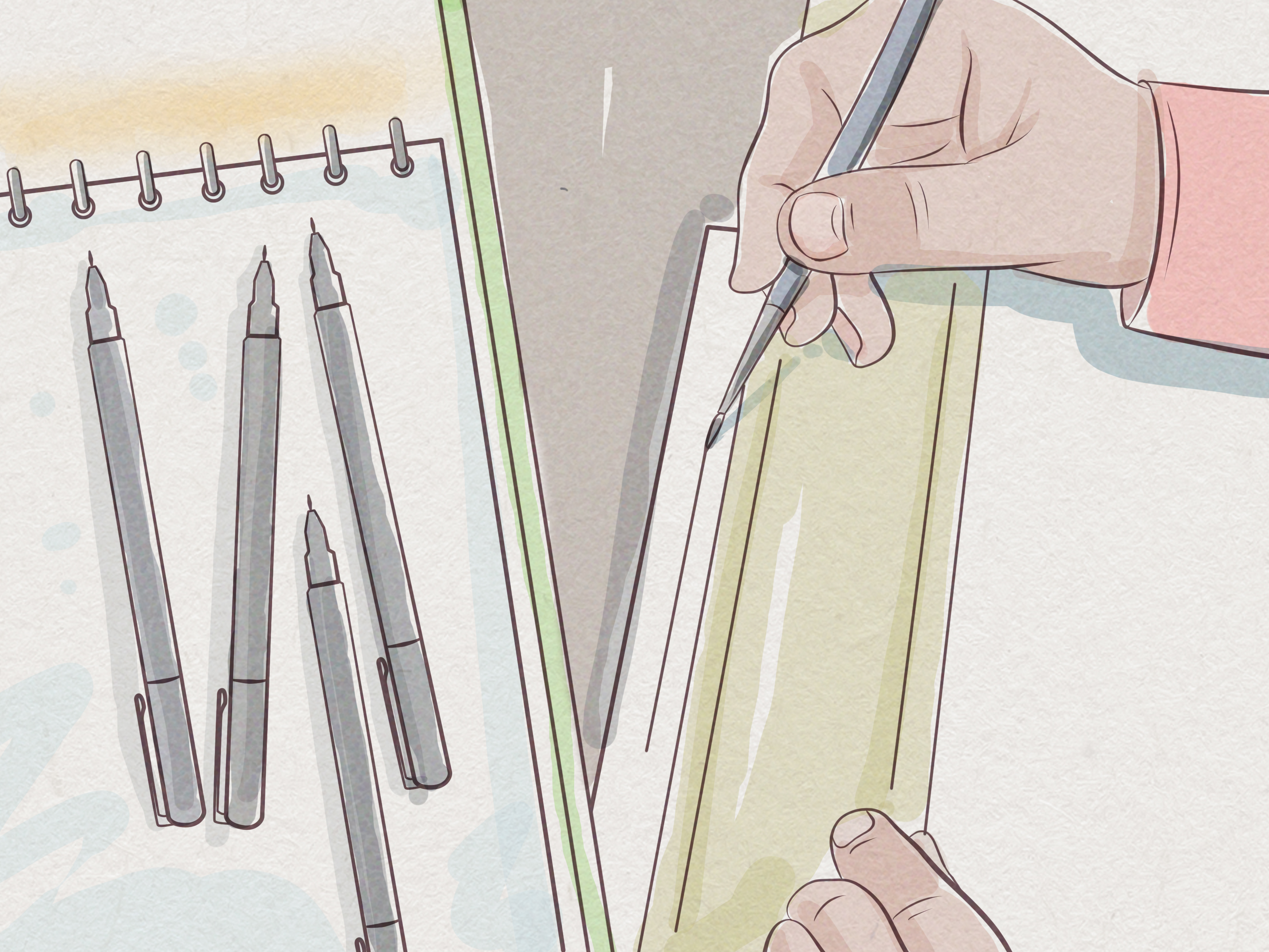
7. Draw Tiny Thumbnails First
Thumbnails are small, rough sketches that help you plan composition before you spend hours rendering eyelashes on a frog. Keep them quick and simple. Use boxes, arrows, stick figures, and loose shapes. The goal is to test ideas, not win a museum exhibition for miniature chaos.
Thumbnails help you solve key questions: Where is the focal point? Where will the text go? Is the action clear? Are the compositions varied? Does every spread feel the same? A book with twelve straight-on scenes can feel static, even if each individual drawing is lovely.
Vary your visual “camera.” Use wide shots to establish setting, medium shots for interaction, close-ups for emotion, and unusual angles for humor or drama. In picture books, composition controls attention. Lead the eye where the story needs it to go.
8. Make a Picture Book Dummy
A picture book dummy is a rough mock-up of the entire book. It may be a folded paper booklet, a PDF, or a digital layout with sketches and text placed on pages. This is where the book starts behaving like a real book instead of a pile of promising drawings.
The dummy helps you test pacing, page turns, rhythm, text placement, and visual continuity. Read it aloud while turning the pages. If a joke lands too early, move it. If a dramatic reveal appears on the wrong side of the spread, adjust it. If the main character disappears for four pages because the background became too fascinating, bring the little star back.
A dummy also reveals whether the manuscript has enough visual variety. If five spreads in a row show two characters talking in the same room, consider changing viewpoint, adding a parallel visual subplot, or using body language to create movement.
9. Plan Text Placement Early
Text and image must cooperate. Do not finish a full-bleed masterpiece and then discover the only empty space for the words is on top of a raccoon’s emotional support waffle. Plan text areas from the thumbnail stage.
Leave quiet zones where type can sit comfortably. Avoid placing text over busy textures, important faces, or high-contrast patterns. If the book will be designed by a publisher, the art director may handle final typography, but the illustrator still needs to leave smart space. If you are self-publishing, choose readable fonts, generous line spacing, and clear contrast.
For accessibility, avoid relying on color alone to communicate meaning. Make sure important visual information is understandable through shape, placement, expression, or context. Consider readers with low vision, dyslexia, or color blindness. Beautiful design should invite more readers in, not make them feel like they need a magnifying glass and a treasure map.
10. Create Rough Sketches for Every Spread
After thumbnails and dummy revisions, create larger rough sketches. These should show character poses, expressions, setting details, major props, text areas, and the flow of action. Rough sketches are still flexible, but they should be clear enough for feedback.
Check continuity carefully. Does the bedroom window stay on the same wall? Does the dog’s collar remain yellow? Did the backpack vanish into another dimension? Keep a continuity sheet for recurring objects, costumes, rooms, vehicles, and background characters.
Rough sketches are also the best time to improve acting. Children’s book characters need expressive body language. A slumped shoulder, clenched mitten, raised eyebrow, or tiny proud stance can carry more emotion than a paragraph of explanation.
11. Revise With Fresh Eyes and Real Feedback
Revision is not a punishment. It is where the book gets better. Show the dummy or rough sketches to trusted critique partners, an art director, an editor, or readers familiar with children’s books. If possible, observe children reacting to the story. They are honest reviewers. Sometimes brutally honest. A child who loses interest halfway through is not being rude; they are giving you market research with sticky fingers.
Look for patterns in feedback. One person’s confusion may be personal taste. Five people missing the same plot point means the illustration needs clearer storytelling. Revise for clarity first, beauty second. A gorgeous illustration that fails to communicate the story is like a cake made entirely of frosting: impressive, but structurally suspicious.
12. Produce Final Artwork Professionally
When the sketches are approved, move to final art. Work at the correct trim size, include bleed if artwork extends to the edge, and keep important text and faces away from trim and gutter areas. For print, images are commonly prepared at 300 ppi, and many printers require CMYK color files or print-ready PDFs. Always check the specific requirements of your printer or publishing platform before final export.
If working traditionally, scan artwork at high resolution and clean files carefully. Preserve texture without leaving dust, shadows, or accidental paper edges. If working digitally, organize layers, name files clearly, and back up your work. A lost final spread is not a plot twist anyone requested.
Review proofs before publication. Colors can shift in print. Fine lines can disappear. Dark scenes may become too dark. A proof copy lets you catch problems before readers meet them.
13. Prepare the Cover, Files, and Portfolio Pieces
The cover must communicate genre, mood, audience, and story promise instantly. It should work as a full-size print cover and as a tiny online thumbnail. Keep the title readable. Make the main character appealing. Avoid clutter. A cover is not the place to include every scene, every sidekick, and the entire emotional arc of chapterless civilization.
Prepare final files according to publisher, printer, or platform specifications. Keep interior and cover files separate when required. Check bleed, margins, color space, resolution, page order, and barcode placement. If you are submitting to agents or publishers as an author-illustrator, create a clean dummy PDF and include a few finished sample spreads that show the final style.
Finally, update your illustration portfolio. Show sequential storytelling, consistent characters, children, animals, environments, emotion, action, and finished book-style art. Art directors want to see that you can tell a story across pagesnot just draw one excellent dragon with excellent cheekbones.
Common Mistakes to Avoid When Illustrating a Children’s Book
Making Every Page Too Busy
Young readers love details, but they also need a clear path through the picture. Give each spread a focal point. Use detail as a reward, not a traffic jam.
Ignoring the Gutter
The gutter is the center fold where pages meet. Avoid placing important faces, tiny text, or key action there. Nobody wants the hero’s nose swallowed by book binding.
Changing Character Proportions
Inconsistent characters can distract readers. Use model sheets and compare pages as you work. Consistency builds trust and helps children recognize emotional changes quickly.
Forgetting the Reader’s Eye Level
Children experience the world from a lower viewpoint. Illustrations can feel more immersive when they occasionally reflect a child’s perspective rather than always looking down from adult height.
Skipping the Dummy Stage
The dummy is where pacing problems reveal themselves. Skipping it is like baking bread without checking whether you added yeast. Something may rise, but it might be panic.
Experience Notes: What the Process Feels Like in Real Life
Illustrating a children’s book often begins with confidence and a fresh sketchbook. “This will be fun,” you say, sharpening a pencil with the optimism of a person who has not yet drawn the same bunny 47 times. The first sketches feel loose and exciting. The character appears. The world opens. Then the practical questions arrive wearing sensible shoes: Can this bunny turn around? Can the treehouse fit on a vertical page? Where will the text go? Why does the grandmother look younger than the child?
One of the most useful experiences in children’s book illustration is learning to fall in love with planning. Beginners sometimes think planning will make the art stiff, but the opposite is usually true. A strong dummy gives you freedom. Once you know the pacing works, you can play more confidently with expressions, color, texture, and visual jokes. The structure becomes a playground fence: not there to ruin the fun, but to keep the story from wandering into traffic.
Another real-world lesson is that children respond to emotional truth faster than technical perfection. A slightly wobbly drawing with a funny, honest expression can be more memorable than a flawless painting with no personality. That does not mean craft is unimportant. It means craft should serve feeling. If a character is scared, proud, jealous, curious, or secretly holding a cookie behind their back, the reader should sense it before reading the words.
Feedback also becomes easier with practice. Early in the process, critique can feel like someone has put your favorite drawing in a tiny courtroom. But good feedback is not an attack on your talent. It is a flashlight. It shows where the story is unclear, where the pacing drags, or where the design needs breathing room. The strongest illustrators revise without losing the heart of the work.
Printing teaches humility, too. Colors that glow on a screen may become quieter on paper. A delicate texture may vanish. A dark purple night scene may print like a mysterious rectangle. Proofs are not optional luxuries; they are reality checks. The printed book is the final reading experience, so judge the art in the format readers will actually hold.
Perhaps the biggest lesson is that illustrating a children’s book is a marathon disguised as a tea party. It requires imagination, patience, organization, humor, and the ability to solve dozens of tiny problems without losing the joy that made you start. The reward is special: a child turning pages, noticing details you hid, laughing at the tiny frog in the corner, and asking to read it again. That moment is worth every revised sketch, every file name, and every bunny drawn from the back.
Conclusion
Learning how to illustrate a children’s book means learning to think like an artist, designer, storyteller, actor, editor, and occasionally a detective investigating missing socks in a bear’s laundry room. The process starts with understanding the manuscript and ends with print-ready files, but the heart of the work is always the same: create pictures that help children feel, wonder, laugh, and turn the page.
The best children’s book illustrations do more than decorate. They expand the story. They reveal character. They create rhythm. They give young readers visual surprises and emotional clues. With strong planning, consistent character design, thoughtful page turns, accessible layouts, and careful final production, your illustrated book can become the kind of story children want to revisit again and againwhich is the highest compliment, even when they request it at bedtime for the ninth night in a row.
