
Skincare
State of SaaS Onboarding – Userpilot
Jul
SaaS onboarding has graduated from a friendly welcome message and a five-slide tour into something far more strategic. It is now the bridge between acquisition and retention, the place where a promising signup either becomes an active customer or quietly disappears into the analytics wilderness.
Userpilot’s State of SaaS Onboarding research offers a useful snapshot of how software companies handle this critical first stage. Its findings reveal an industry that has embraced free access and product-led growth but still struggles with unnecessary signup barriers, generic guidance, and onboarding experiences that explain too much while helping users accomplish too little.
The big lesson is simple: users do not sign up because they dream of completing onboarding. They sign up because they have a job to finish. Effective SaaS onboarding helps them finish that job sooner, with fewer wrong turns and considerably fewer tooltips shouting, “Look over here!”
What the State of SaaS Onboarding Report Examines
Userpilot reviewed the onboarding journeys of more than 100 SaaS products for its 2023 report. The research explored the path from account creation to early product adoption, including free trials, freemium plans, signup requirements, welcome screens, microsurveys, videos, product tours, interactive walkthroughs, checklists, and progress indicators.
Although the data represents a particular sample and time period, it remains valuable as a benchmark. It shows what SaaS companies were actually doing rather than what product teams said they planned to do after the next roadmap meeting.
The report’s central question
Every onboarding element should answer one practical question: does this step move the user closer to meaningful value? A feature tour may look polished, but if users finish it without creating anything, connecting data, inviting a teammate, or completing another activation event, the tour has mostly provided a guided sightseeing trip.
That distinction between exposure and progress runs throughout modern onboarding strategy. Showing users the interface is not the same as helping them succeed with it.
Free Trials and Freemium Have Become the Default Invitation
Userpilot found that more than 74% of the reviewed SaaS tools offered a free trial, while nearly 41% provided a free account. Some companies offered both a permanent free tier and a temporary trial of premium features. Only 4% relied exclusively on a demo without giving prospects direct access to the product.
This shift reflects the growing influence of product-led growth. Buyers increasingly expect to inspect the merchandise before purchasing it. A pricing page can promise increased productivity, improved collaboration, and possibly a brighter future, but users still want to click around and see whether the software makes sense.
Access alone does not create product-led growth
Offering a free trial is not the same as building a self-serve customer journey. The product must communicate value, guide setup, handle common questions, and recover users who become stuck. Otherwise, a free trial merely gives prospects a convenient way to experience confusion without entering a credit card number.
Companies should design the trial around a defined success event. For a project management tool, that might be creating a project and assigning the first task. For an analytics platform, it might be connecting a data source and viewing an initial report. For an email product, it could be importing contacts and preparing a campaign.
The trial should make that outcome easier to achieve, not bury it beneath administrative chores.
Signup Friction Remains a Major Weakness
Despite the growth of self-serve SaaS, Userpilot classified approximately 79% of the products it studied as having a friction-based signup process. Its definition of frictionless signup was intentionally strict: ask primarily for a name and email address, avoid demanding credit card information, and do not force email confirmation before users can enter the product.
Common barriers included mandatory verification, long forms, premature company questions, password rules worthy of a national security agency, and credit card requests before the user had seen anything useful.
Not all friction is bad
Some friction protects the business or the customer. Financial software may require identity verification. Enterprise platforms may need information about company size, security requirements, or technical infrastructure. A complex implementation may benefit from qualification before users begin.
The problem is accidental friction: steps included because they have always been included, because another department requested more data, or because nobody has tested whether the fields are necessary.
A practical rule is to delay every request that is not required for the next meaningful action. Let users explore a dashboard before confirming an email when security policies allow it. Ask for a credit card when premium access genuinely begins. Request company details only when those answers will immediately change the experience.
Use convenient authentication
More than half of the products in Userpilot’s sample offered a single sign-on option. Google, Microsoft, and similar authentication methods can reduce password fatigue and make returning to the product easier. Magic links may also help, provided the email arrives quickly and does not turn login into an inbox scavenger hunt.
Welcome Screens Should Personalize, Not Merely Wave Hello
A welcome screen can introduce the product, set expectations, and give users a clear next step. Yet its most valuable function is often segmentation.
Instead of displaying the same generic tour to everyone, a SaaS company can ask one or two concise questions:
- What are you trying to accomplish?
- What is your role?
- Which workflow do you want to set up first?
- How experienced are you with this type of software?
The answers can route users toward relevant templates, features, and instructions. An agency owner, freelance designer, and enterprise administrator may use the same platform for entirely different reasons. Giving all three the same 15-step product tour is efficient only in the sense that everyone can be confused at once.
Microsurveys need a visible consequence
Userpilot reported that 76% of the MarTech products in its study used some form of microsurvey. That adoption is encouraging, but collecting information is only the beginning.
When users say they want to create marketing reports, the next screen should help them connect a data source or open a suitable template. When they identify themselves as beginners, the product can provide more guidance. Experienced users may prefer a faster route with optional help.
A survey that asks about goals and then launches the same experience for everybody is personalization theater. The questions looked thoughtful; the product simply forgot to listen.
Interactive Walkthroughs Beat Passive Product Tours
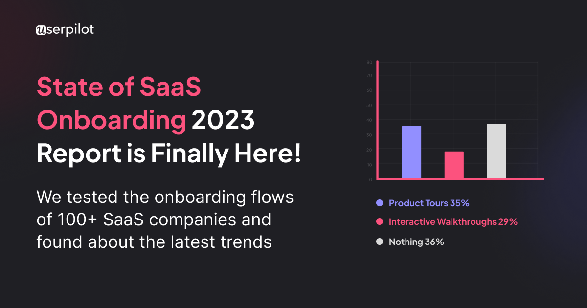
Userpilot found that 35% of the reviewed products used traditional product tours, 29% used interactive walkthroughs, and 36% offered no in-app guidance at all.
A traditional tour usually points to interface elements through a sequence of tooltips or modal windows. It might explain where reports, settings, integrations, and billing features live. The user clicks “Next” repeatedly and may retain roughly as much information as someone hearing airport announcements while searching for a missing suitcase.
An interactive walkthrough asks the user to perform meaningful actions. The next instruction appears only after the current action is complete. Users learn inside the real workflow while producing actual progress.
Teach the next action, not the whole product
Good onboarding uses progressive disclosure. It reveals information when it becomes useful rather than unloading every feature during the first session.
For example, a reporting platform does not need to explain advanced permissions before the user has created a report. A collaboration tool does not need to introduce archive policies before anyone has invited a teammate. Contextual guidance reduces cognitive load and makes complex software feel manageable.
Help content should also be dismissible and easy to retrieve later. Users should never have to choose between completing a tutorial immediately and losing it forever.
Video Works Best as Support, Not a Substitute for Action
Short videos can explain complex concepts, demonstrate unfamiliar workflows, and add a human voice to the onboarding experience. Userpilot recommends keeping onboarding videos brief and using them when showing is genuinely clearer than telling.
However, video should normally supplement interactive instruction rather than replace it. Users may watch a polished demonstration and still have no idea how to perform the task inside their own account.
Offer a concise video beside written steps or contextual guidance. Add captions, controls, and a clear description of what the video covers. Never make a three-minute recording the only route to information that could have been communicated in two sentences.
Checklists and Progress Bars Need a Purpose
Onboarding checklists can reduce uncertainty by showing users what to do next. Progress indicators can create momentum, especially when the list begins with one or two legitimate completed items, such as creating an account or selecting a goal.
But a checklist is not automatically valuable simply because it has cheerful checkmarks. Every item should correspond to an action associated with activation or future retention.
A useful checklist might include:
- Create the first project.
- Import or connect real data.
- Complete a core workflow.
- Invite a teammate when collaboration drives value.
- Review the first meaningful output.
Tasks such as “visit the settings page” or “read about our company” may improve completion statistics without improving customer outcomes. That is how teams end up celebrating a 90% checklist completion rate while wondering why paid conversion remains stubbornly unimpressed.
Newer Userpilot benchmark data illustrates the challenge. Across 188 B2B SaaS companies, average onboarding checklist completion was reported at 19.2%, with a median of 10.1%. These numbers should be treated as context rather than universal targets. A short checklist tied to a simple workflow cannot be compared directly with a technical implementation involving data migration and multiple stakeholders.
The Metrics That Reveal Whether Onboarding Works
Onboarding completion is useful, but it is not the final objective. Product teams need to connect onboarding behavior with activation, retention, adoption, and revenue.
Time to value
Time to value measures how long it takes a new user to experience a meaningful benefit. Userpilot’s broader product benchmark places average time to value at roughly one day and 12 hours across its dataset, while top-performing products can deliver an initial value moment in minutes.
The correct target depends on the product. A design application might demonstrate value during the first session. An enterprise data platform may need integrations, permissions, and technical validation. The goal is not to copy a universal number but to remove avoidable waiting from the journey.
Activation rate
Activation rate is the percentage of new users who reach a defined milestone that predicts continued use. Userpilot has reported an average activation rate of about 37.5% in its SaaS benchmark data.
Teams should define activation through behavioral evidence rather than intuition. Compare retained and churned cohorts to identify actions associated with long-term use. The result may be a single event or a combination, such as importing data, publishing an asset, and returning within seven days.
Early retention and feature adoption
Day-one, day-seven, and first-month retention reveal whether users return after the initial excitement fades. Feature adoption shows whether they engage with the capabilities that deliver ongoing value.
Segment these metrics by role, use case, plan, company size, acquisition channel, and onboarding path. An overall activation rate can hide one segment that performs brilliantly and another that is quietly sinking through the floorboards.
Qualitative evidence
Funnels show where users leave, but they do not always explain why. Combine event data with session replays, support tickets, customer interviews, usability tests, and short surveys. A sudden drop-off may reflect confusing copy, a technical error, missing data, slow loading, or a button hidden beneath an enthusiastic tooltip.
What Modern SaaS Onboarding Is Becoming
The industry is moving from static tours toward adaptive onboarding systems. These systems use profile information, account data, in-product behavior, and customer intent to decide what guidance appears next.
Continuous onboarding
Onboarding should continue beyond the first login. Users need additional guidance when they encounter advanced workflows, receive new permissions, adopt recently released features, or return after a long absence.
Continuous onboarding introduces information at the moment of need. It keeps the first experience lighter while allowing education to expand as the user becomes more capable.
AI-assisted guidance
AI can help summarize documentation, answer contextual questions, identify funnel drop-offs, recommend next steps, and adapt instructions to a user’s role or behavior. The useful version of AI onboarding is not a chat bubble that cheerfully says, “How can I help?” while knowing nothing about the account.
It should recognize context. A capable assistant might notice that an imported file contains errors, explain the three issues preventing setup, and guide the user through corrections.
AI agents also create a new measurement problem. Some software is now accessed through APIs, integrations, and autonomous agents rather than human interface sessions. Product teams may need separate activation definitions for human users, machine users, and accounts where both work together.
A Practical SaaS Onboarding Improvement Plan
1. Define value before designing UI patterns
Identify the first outcome users came to achieve and the behaviors that predict retention. Do this before choosing between a modal, checklist, tooltip, video, or interpretive dance.
2. Map the shortest successful path
Document every step between signup and first value. Remove unnecessary fields, decisions, empty states, and waiting periods. Use templates or sample data when they help users understand the result faster.
3. Build a small number of meaningful segments
Begin with role, primary goal, or experience level. Create distinct paths only when the differences change what users should do next.
4. Trigger guidance through behavior
Respond to what users have completed, skipped, or attempted. A person who activated in ten minutes should not receive the same reminder as someone who has not connected required data after three days.
5. Measure the full funnel
Track signup completion, time to value, activation, checklist progression, core feature adoption, early retention, conversion, and support demand.
6. Experiment continuously
Test fewer steps, different templates, revised calls to action, alternative task order, and segment-specific guidance. Judge experiments by downstream behavior, not merely clicks on the “Next” button.
Practical Experience: What Teams Learn When Rebuilding SaaS Onboarding
One of the most common experiences in an onboarding project is discovering that the original flow was designed around the product’s navigation rather than the customer’s objective. The tour begins at the top-left menu, visits every major section, and ends with a triumphant message announcing that the user is ready. The user, meanwhile, has not created a single useful thing. Reframing the journey around an outcome often removes half the steps immediately.
Consider a hypothetical reporting platform with a 12-step onboarding tour. The tour explains dashboards, filters, sharing controls, user management, integrations, alerts, and billing. Analytics show that most trial users leave before connecting a data source. The team replaces the tour with three tasks: choose a reporting goal, connect one source, and generate a starter dashboard from a template. Advanced features appear only after the first report is created. The new flow feels smaller because it is smaller, but it also produces something the user can evaluate.
Another recurring lesson is that personalization should begin modestly. Teams sometimes imagine dozens of personas, branching journeys, and exquisitely tailored messages. The system becomes difficult to maintain before it has demonstrated any value. A better starting point is one question with operational consequences: “What do you want to accomplish first?” Three meaningful answers can support three focused experiences without turning the onboarding builder into a plate of spaghetti.
Teams also learn that empty states are part of onboarding. A blank dashboard with a prominent “Create” button may look clean to the designer who has stared at the product for six months. To a new user, it can feel like arriving at an unfurnished apartment with no instructions and a mysterious toolbox. Templates, sample projects, previews, and import options give the user something concrete to modify. Editing an example is often easier than inventing a structure from nothing.
Behavioral messaging usually outperforms rigid calendar sequences. A generic email sent on day three may recommend inviting teammates even though the recipient has not completed setup. A behavior-based message can respond to the real obstacle: a failed integration, an unfinished project, or an unused core feature. Timing messages around actions makes the communication feel helpful rather than automated, even though automation is doing the heavy lifting.
Onboarding redesigns frequently expose product problems that no tooltip can repair. If users repeatedly misunderstand a label, fail to notice a primary action, or cannot recover from an error, adding more instructional text may only decorate the confusion. Sometimes the correct onboarding improvement is a clearer button, a better default, a shorter form, or a redesigned workflow.
The final lesson is organizational. Onboarding cannot belong exclusively to product marketing, customer success, design, or growth. Each team sees a different part of the problem. Product understands behavior, design manages clarity, customer success hears objections, support sees recurring failures, marketing knows the promise that brought users in, and engineering understands technical constraints. The strongest programs create shared definitions for activation and time to value, then review the data together.
That collaboration turns onboarding from a launch checklist into an operating system for customer learning. Instead of asking whether the tour has been published, the team asks whether more users are reaching value, returning, adopting core features, and converting. That is a much tougher questionand a considerably more useful one.
Conclusion
Userpilot’s State of SaaS Onboarding research describes a market with widespread free access but uneven execution. Trials and freemium plans are common, yet signup friction, generic tours, weak personalization, and missing in-app guidance continue to slow activation.
The best SaaS onboarding experiences do not attempt to teach the entire product. They identify the user’s goal, shorten the route to a meaningful result, provide guidance in context, and reveal additional capabilities as the user becomes ready for them.
The competitive advantage is not a larger collection of popups. It is a product that understands what success looks like and helps customers reach it with less effort. When onboarding accomplishes that, it stops being an introductory sequence and becomes a genuine growth engine.

