
Skincare
Pale and Interesting: An Artful and Economical Renovation in Vancouver, BC
Jul
Note: This is an original article inspired by a publicly documented Vancouver renovation and informed by broad U.S. home-design, renovation, safety, and energy-efficiency guidance. It is not a reprint or an official project description.
There is a persistent myth in home design that a beautiful renovation requires either a lottery win, a contractor who accepts payment in baked goods, or a dramatic personality change involving marble countertops and a suspicious number of brass cranes. Thankfully, a memorable Vancouver renovation proves otherwise.
Set in a modest postwar bungalow, this artful renovation demonstrates how a home can become brighter, more functional, and deeply personal without erasing everything that came before. The recipe is not complicated, although it does require some discipline: use a restrained palette, preserve what still has character, spend carefully on the parts that affect daily life, and let handmade or collected objects do the storytelling.
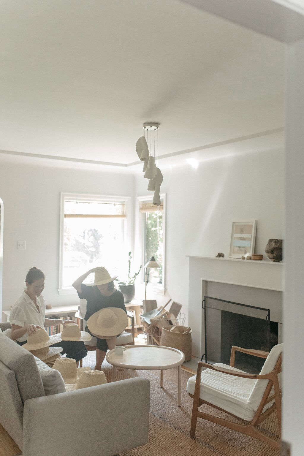
The result is pale, yes, but never bland. The interiors use soft white as a backdrop for brick, timber, woven baskets, vintage furniture, coastal finds, and graphic blackened wood outside. It is proof that a budget renovation can feel layered and original instead of looking like a waiting room with better lighting.
A Modest Vancouver Bungalow Gets a Second Act
The home began as an unremarkable 1945 bungalow on a busy Vancouver street. It had two bedrooms upstairs, a basement suite, and plenty of the practical quirks that make older homes both lovable and mildly exhausting. Rather than launch into a full demolition spree, the owners made early improvements that delivered visible impact without requiring a giant construction budget.
They painted the interior walls white, refreshed the kitchen cabinetry, and even painted the backsplash. That move sounds almost too simple, but it changed the emotional temperature of the rooms. Dark, dated, or disconnected surfaces can make a compact home feel smaller than it really is. A cohesive pale palette allows daylight, furniture, and texture to move through the space more easily.
Later, when the family needed more room, the home received a new primary bedroom and deck addition at the rear. Instead of trying to make the extension imitate the original stucco bungalow, the design leaned into contrast. The older home remained modest and familiar, while the new section was wrapped in dramatic charred-wood cladding.
That decision is one of the project’s smartest lessons: old and new do not have to pretend they were born on the same day. A thoughtful contrast can be more honest, more memorable, and sometimes more economical than chasing an exact historical match.
Why Pale Interiors Can Feel Rich Instead of Empty
A pale renovation works best when white is treated as a canvas rather than a finish line. White walls alone do not create character. They simply give character a place to show up.
Use One Calm Background Color
The Vancouver home used a consistent white paint color throughout much of the interior. A uniform wall color reduces visual interruptions, especially in a small or irregularly shaped house. It also makes architectural details, artwork, baskets, wood furniture, and textiles feel more intentional.
The trick is choosing a white with some personality. Pure, icy white can feel harsh in a rainy Pacific Northwest climate, while a warm white with subtle gray, cream, or pink undertones can make a room feel softer and more grounded. Paint samples should be tested on several walls and viewed in the morning, afternoon, and evening. Paint is a tiny drama queen; it behaves differently under every kind of light.
Build Texture Into the Quiet Palette
The renovation avoids the “all-white-and-no-life” problem by layering natural materials. Woven baskets, vintage bentwood chairs, a textured rug, wood shelving, brick, handmade ceramics, and collected objects give the rooms depth. These materials create contrast without requiring a parade of bold colors.
For homeowners trying this look, the goal is not to buy every basket within a 50-mile radius. Instead, select a few pieces that have shape, history, or useful function. A large woven vessel can anchor an entry. A vintage stool can work as a bedside table. A weathered ceramic bowl can sit on an open shelf without screaming, “I was purchased 14 minutes ago because the shelf looked lonely.”
The Economic Renovation Strategy: Improve Before You Replace
One reason this Vancouver renovation feels practical is that it does not confuse “new” with “better.” The owners worked with what they had before making larger changes. This is a useful rule for nearly any budget-conscious home renovation.
Start by asking three questions about every existing element:
- Does it still work safely and reliably?
- Can it be repaired, painted, refinished, or adapted?
- Would replacing it improve function enough to justify the cost?
Kitchen cabinets are a perfect example. If cabinet boxes are structurally sound and the layout functions reasonably well, painting them, updating pulls, replacing doors, or removing selected upper doors may create a major visual change without the expense of a full kitchen rebuild.
In the Vancouver kitchen, the upper cabinet doors were removed to create open shelving, while the existing knobs were replaced with leather pulls. This made the kitchen feel lighter and more personal without requiring a total teardown. Open shelving is not for everyone, particularly people who own 27 mismatched mugs and consider dusting a seasonal sport. But used selectively, it can make a small kitchen feel more open while keeping everyday dishes within easy reach.
The kitchen also included a remarkably inventive pot rack made from a repurposed clothing rack found when a shop was closing. The rack was altered, fitted with feet, and suspended from the ceiling. It is exactly the kind of move that gives a renovation personality: practical, affordable, slightly unexpected, and much more memorable than another generic chrome organizer.
Preserve the Details That Give an Older Home a Pulse
Budget-friendly renovation does not mean preserving every outdated feature simply because it is old. Some parts of an aging home deserve a respectful retirement. But original details with real material value can often be restored or reimagined.
In the Vancouver living room, the gas fireplace insert was removed, allowing the original brick hearth to return to the spotlight. A new concrete extension and custom surround updated the composition while keeping the room connected to the home’s history.
That approach is more compelling than flattening every surface into drywall and calling it “modern.” Brick, fir flooring, old tile, vintage hardware, and original millwork can add warmth that brand-new materials often spend years trying to imitate.
Before removing older features, inspect their condition carefully. Some may need professional repair. Others may hide water damage, outdated wiring, lead paint, or structural problems. Homes built decades ago can contain wonderful surprises, but they can also contain the kind of surprise that makes your renovation budget quietly leave the room.
Safety Before Style
Any renovation involving a pre-1978 home should include appropriate assessment for lead-based paint and other hazardous materials. In Vancouver, homeowners should also work with qualified local professionals who understand British Columbia regulations, permit requirements, moisture control, electrical upgrades, and building-envelope performance.
Older houses may need work behind the walls before they need prettier walls. Addressing leaks, insulation gaps, ventilation, drainage, wiring, and structural issues first protects the investment in paint, furniture, flooring, and finishes later.
Contrast Makes the Addition Feel Intentional
The rear addition is where the renovation becomes especially confident. Rather than trying to mimic the original bungalow’s stucco exterior, the new volume uses dark charred-wood cladding. The contrast creates a clear architectural conversation between old and new.
This idea can work well for additions, garden studios, garages, decks, and backyard rooms. A contemporary addition does not need to copy every trim profile, roofline, or siding detail from the original house. In fact, forcing a fake historical match can make an addition look awkwardly costume-like.
A better strategy is to preserve the scale and spirit of the original home while using a simplified modern material palette for the new work. The link between old and new can come from proportion, window alignment, roof height, shared materials, or repeated colors rather than imitation.
In this project, the pale interior and dark addition create a pleasing tension. The house is soft and airy inside, bold and grounded outside. It feels a little like wearing a crisp white shirt with excellent black boots: understated, useful, and not remotely boring.
Design for Real Life, Not Just the Photograph
The strongest part of the renovation may be its emphasis on real family life. The home includes custom built-ins, flexible furnishings, and a specially designed enclosed bed that supports a child’s needs while still feeling playful and warm.
This is an important reminder that good residential design is not about copying a trend board. It is about making daily routines easier. A custom bed, bench, shelf, closet, or storage wall can solve a specific problem more effectively than expensive furniture chosen only for looks.
Accessible and adaptable design does not have to appear clinical or impersonal. It can look joyful, handmade, and integrated into the home. A built-in can hold books and toys. A bench can offer shoe storage. A low shelf can give children independence. Better circulation can make a room more comfortable for everyone, not just one family member.
How to Borrow the Look Without Copying the House
You do not need a Vancouver bungalow, an architect in the family, or a rare coastal treasure collection to learn from this renovation. The most useful ideas are adaptable.
Start With a Phased Plan
Divide your renovation into three categories: urgent repairs, high-impact cosmetic changes, and long-term projects. Fix water, electrical, structural, and safety issues first. Then consider paint, lighting, hardware, storage, and furniture. Larger additions, new windows, major kitchen changes, and exterior projects can come later when the budget is ready.
Choose One Big Gesture
An economical renovation should still have one memorable move. It may be a restored brick fireplace, a blackened exterior addition, an oversized pendant light, a dramatic piece of art, a custom plywood bed, or a wall of built-ins. One strong idea creates focus and prevents the home from becoming a collection of random upgrades.
Mix High and Low With Purpose
Spend where your hands and feet go every day: durable flooring, quality plumbing, good lighting, secure doors, hardware that feels solid, and storage that works. Save on decorative items that can be sourced secondhand, repurposed, or upgraded later.
- Worth spending on: moisture protection, windows, insulation, safe electrical work, durable flooring, built-ins, and ventilation.
- Worth saving on: decorative accessories, side tables, some lighting, hardware, art frames, open shelving, and kitchen styling.
- Worth reusing: brick, timber, cabinet boxes, vintage chairs, sturdy doors, old mirrors, baskets, and furniture with good bones.
Experience Notes: What It Feels Like to Live With a Pale, Artful Renovation
Living in a pale, artful home is less about inhabiting a white box and more about noticing small things. Morning light becomes part of the furniture. The grain in a wood chair matters. A bowl on a shelf stops being clutter when it has a story. A handwoven basket can hold blankets, laundry, toys, or the mysterious pile of things that seems to reproduce near every front door.
The first experience is calm. A unified light palette makes rooms feel less argumentative. In many homes, every surface is competing for attention: dark floors, loud cabinets, busy tile, patterned curtains, and a sofa that appears to have been designed during a caffeine emergency. A pale backdrop reduces the noise. It gives the eye a place to rest, which can make a modest room feel more spacious and more forgiving.
The second experience is flexibility. Pale walls allow furniture and objects to evolve over time. A vintage chair can be introduced without causing a style crisis. A bright quilt, a graphic painting, a stack of books, or a handmade ceramic vase can add color without requiring a new decorating plan. This is especially useful for families because homes change constantly. Children grow, work shifts home, hobbies multiply, and suddenly the dining table has become a homework station, office desk, craft zone, and emergency snack counter.
The third experience is practicality. In a compact house, every object has to earn its place. Open shelving can make frequently used dishes easier to reach. A ceiling pot rack can free cabinet space. Built-ins can reduce the need for bulky storage furniture. A portable side table can move from sofa to bed to deck. The home feels more efficient because its pieces are doing more than one job.
There is also an emotional benefit to preserving old materials. Restored brick, worn timber, vintage chairs, and inherited objects create a sense that the home has a past. A renovation does not need to erase signs of age to feel fresh. Sometimes the small imperfections are what keep a room from looking like it was assembled from a catalog during one aggressively productive Saturday.
The darker exterior addition changes the experience again. From inside, the pale rooms feel open and soft. From the garden or deck, the blackened wood gives the home visual weight. It creates a shelter-like feeling, especially in a rainy climate where contrast against gray skies can feel dramatic in the best possible way.
Most importantly, this style of renovation encourages a slower relationship with the home. Instead of replacing everything at once, you notice what works, what needs repair, and what could become beautiful with a little imagination. That is the true luxury of an economical renovation: not spending less for the sake of it, but spending with enough care that the home becomes more useful, more personal, and more interesting over time.
Final Thoughts: Pale Does Not Mean Safe, and Economical Does Not Mean Ordinary
The Vancouver renovation succeeds because it balances restraint with personality. White paint creates room to breathe. Original brick and vintage furniture provide history. Handmade baskets and collected objects introduce texture. A repurposed pot rack adds humor and resourcefulness. The dramatic addition proves that contrast can be more powerful than imitation.
Its broader lesson is simple: an economical renovation does not need to look inexpensive. Preserve what has soul. Repair what matters. Spend on comfort and performance. Add one or two bold decisions that make the home feel unmistakably yours. A house does not need endless square footage or a celebrity-sized budget to become artful. Sometimes it just needs better light, smarter choices, and the courage to paint the backsplash.

